
The One-CTA Rule: One Ask Per Page Wins
How many CTAs should a page have? One. The data on why one stage-matched ask beats stacking three, and where the others go.
 By David Jubé · Jun 10, 2026 · 12 min read
A page with five calls to action does not give the reader five chances to convert. It gives them zero.
Every extra ask splits attention and stalls the decision, so the reader who might have done one thing ends up doing nothing. The rule that fixes it is short.
One primary call to action (CTA) per page, matched to the funnel stage the reader is in. Everything else you want them to do stays on the page, but as quiet secondary links, not competing buttons.
That is the whole rule. The rest of this article is the lookup that picks the one ask, the method for demoting the rest, and the cost of getting it wrong.
Key takeaways
- Give each page one primary call to action matched to the reader’s funnel stage, because every extra ask splits attention and stalls the decision.
- Stacking asks lowers conversion: single-link landing pages convert around 13.5 percent while pages with five or more links or asks fall to roughly 10.5 percent.
- A call to action is anything asking the reader to act, including subscribe boxes, download offers, share icons, and related-post rows, so count them all before you change a word.
- Let the funnel stage pick the ask: top of funnel asks for a subscribe or next read, middle of funnel asks for a framework or case note, bottom of funnel makes the direct ask.
- Demote the rest rather than delete it, keeping one loud primary ask and turning everything else into quiet secondary links, since in-line text asks beat banners most readers skip.
The Cost of Stacking
Stacking asks is not neutral. It actively lowers the take rate on the one ask that matters.
Unbounce’s analysis of conversion benchmarks found that landing pages with a single link convert at roughly 13.5 percent, while pages carrying five or more links or asks drop to around 10.5 percent. Same traffic, fewer customers, because the page asked for too much at once.
The mechanism is choice overload, the finding that more options can produce hesitation rather than more decisions. The same dynamic shows up in retail, where studies have found that fewer options can lift sales rather than suppress them.
Adding a second ask does not double your odds. It taxes the first one.
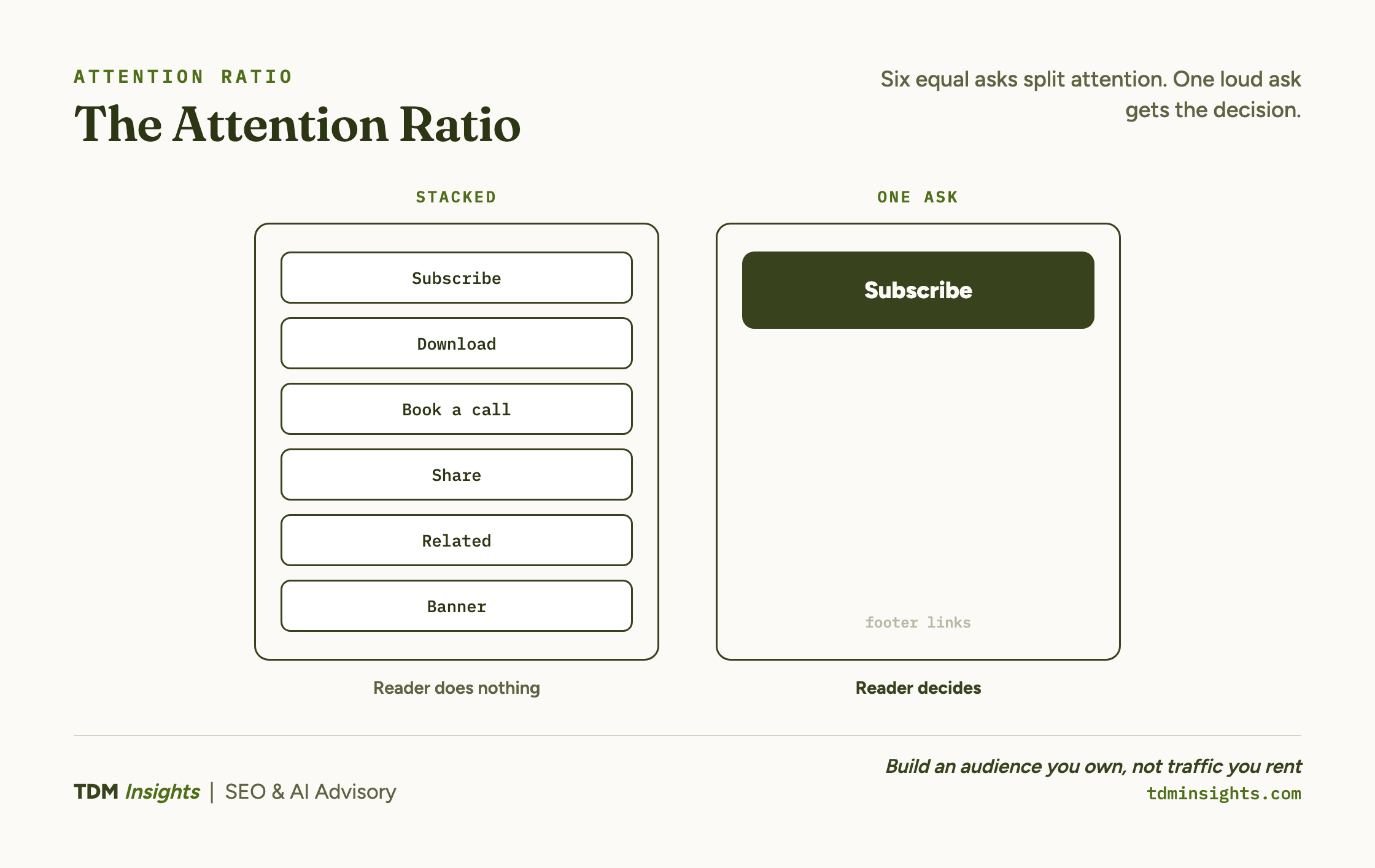
There is a name for the ratio that governs this. Unbounce calls it the attention ratio, the number of things a page lets the reader do versus the number of things you want them to do.
The ideal on a conversion page is one to one. Every link, button, and box you add past the one ask pulls that ratio the wrong way.
There is even a usability law for it: Hick’s Law holds that the time to make a decision rises with the number and complexity of the choices on offer.
So the first move is not to write a better button. It is to count.
How Many CTAs Per Page? Count First
A CTA is anything asking the reader to act, not just the obvious button.
That includes the subscribe box in the sidebar, the download offer mid-article, the “book a call” banner, the social share icons, the row of related-post links, the in-text link to another page, and even a prominent navigation bar. A typical page carries far more asks than the founder who built it realizes, which is exactly why it feels busy and converts poorly.
Count them all before you change anything. The page that feels cluttered usually is, and the clutter is competing asks you stopped seeing.
Do the count on one real page and the number surprises the founder who built it. Take a standard blog post. On it you might find:
- a header subscribe bar
- a sidebar newsletter box
- two banner ads
- a “book a demo” button in the nav
- a download offer halfway down
- four social share icons
- a related-posts grid of six links at the end
- a comment field
That is more than a dozen separate asks, every one of them pulling at the same finite attention, before the article has made its actual point.
The reader is not lazy. They are overloaded, and they resolve the overload by doing nothing.
One distinction matters here, because it is where founders over-correct. An internal link that guides a reader deeper into your library is navigation, not a conversion ask. You are allowed many of those.
The one-CTA rule governs the conversion ask, the single moment where you tell the reader to do the thing that moves them toward becoming a customer. There is one of those per page.
Google’s own search essentials point the same direction: a page should make its single purpose obvious to a reader and a crawler alike, and a wall of competing asks blurs that purpose.
Let the Stage Pick the Ask
The single hardest question is not whether to have one CTA. It is which one.
Do not guess, and do not default to the ask that matters most to your business. Let the reader’s funnel stage decide.
A reader on a broad educational page is in discovery and is not ready to book a call. A reader on a comparison or decision page is much closer.
The right ask is the one that moves this reader to the next stage, not the one that skips three stages to the sale.
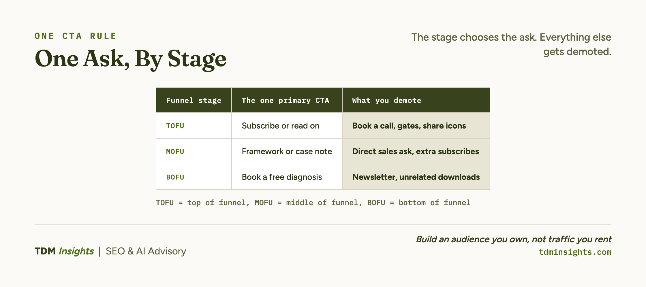
Here is the lookup. Find the stage this page serves, read across, and that is your one primary ask.
Read it as a sequence, not a menu. The TOFU ask earns the right to make the MOFU ask, which earns the right to make the BOFU ask.
A “book a call” button on a discovery-stage article is not asked too clearly. It is asked too soon, and it converts almost no one while signalling you misread where the reader was.
Match the ask to the stage, then commit the whole page to it.
This is one half of the funnel that decides which single ask each page makes. The other half is the stages themselves, and it is worth reading the full build to see where each page sits.
Demote, Do Not Delete
The other things you want the reader to do are not wrong. They are just not primary.
Demoting is the discipline that makes the one-CTA rule livable, because a real page has more than one useful next step. Keep your one primary ask styled to stand out: a button, a callout box, a high-contrast link the eye lands on.
Then turn everything else into low-emphasis secondary links: a quiet text link in a sentence, a footer item, an inline mention with no button treatment.
They stay available for the reader who actively wants them, and they stop competing for the attention your one ask needs to earn the click.
The hierarchy is the point. One thing should be visually loud. Everything else should be quiet but reachable.
This is also a design problem, and the standard CTA button design advice is to give one ask the contrast, size, and whitespace that pull the eye.
Treating two asks as equally prominent is among the common call-to-action mistakes teams make, and it cancels the very focus the rule is built to protect.
Here is what that looks like on the cluttered blog post above. The page is a discovery-stage article, so the lookup says the one ask is subscribe-or-read-on.
Keep one of those, as a single in-line text link placed right after the article delivers its value. Then the rest gets demoted:
- the two banner ads come out
- the sidebar newsletter box collapses into a quiet one-line footer link
- the “book a demo” button leaves the nav, because no discovery reader is ready for it
- the share icons shrink to small footer glyphs
- the six-link related-posts grid becomes a short “read next” line pointing at the one logical next article
Nothing useful was deleted. The reader who wants the demo can still find it.
But the page now has one loud ask and a calm set of quiet ones, and the attention ratio finally points the right way.
Inside blog content specifically, the format of the demotion matters. HubSpot’s research on its own blog found that text-based, in-line CTAs generated the large majority of its blog leads, while end-of-post banners contributed only a few percent, largely because of banner blindness.
Readers skip the designed banner and click the relevant sentence. So on an article, your one primary ask is often best expressed as a prominent in-line text link placed where attention is high, not a banner few readers consciously see.
The same focus pays off off-page too: analyses of email click-through rates show that a single clear ask tends to out-pull a message stuffed with competing links, which is the one-CTA rule playing out in the inbox.
Book a free diagnosis
If your highest-traffic pages get visits but few conversions, the cause is usually structural, not a wording problem you can fix with a better button. A free diagnosis counts the competing asks on your top pages, names the funnel stage each page actually serves, and points to the one ask to keep and the ones to demote first. You leave with a prioritized fix list for the pages you already have. No deck, no pitch, just a clear read.
Where the One Ask Goes Next
Picking the one ask is half the job. Positioning it is the other half.
The rule chooses which ask a page makes. It does not yet decide where on the page that ask sits, and a perfectly chosen CTA buried below where readers stop scrolling still converts no one.
That is a separate mechanic, and it is the reason where that one ask should sit on the page is its own article.
Repeating the same single ask down a long page is fine and often helps. Introducing a second, different ask is what breaks this rule.
The ask also has to live on the right kind of page. The one-CTA rule is strictest on a landing page, where the entire page exists to drive one decision, and looser on a blog post, where a wandering reader is allowed.
That focus is the heart of landing-page conversion-rate optimization: the page commits to a single goal and removes everything that competes with it. Put the right ask on the wrong page type and it still fails, which is why matching the copy to the page type comes next in the sequence.
For the conceptual version of why any of this matters, the overview of turning readers into customers makes the case at a higher level. And none of it works if the visit never happens, which starts upstream with earning the click before the page even loads.
One ask, matched to the stage, with the rest demoted. That is the structure that turns an earned read into a decision instead of a shrug.
Frequently Asked Questions
How many CTAs should a single page have?
One primary call to action per page. A single, stage-matched ask converts better than several competing ones because every extra ask splits attention and stalls the decision. Anything else you want the reader to do still belongs on the page, but as quiet secondary links, not competing buttons fighting your one primary ask.
Do multiple CTAs increase conversions or hurt them?
They usually hurt. Landing pages with a single clear CTA average around a 13.5 percent conversion rate, while pages with five or more links or asks fall to roughly 10.5 percent. More choices create hesitation, not more conversions. The pattern holds across landing pages, emails, and blog posts: focus beats abundance.
What counts as a CTA on my page?
More than the obvious button. A CTA is anything asking the reader to act: subscribe boxes, download offers, “book a call” buttons, social share icons, related-post links, banner ads, and even prominent navigation. A typical page carries far more asks than the founder realizes, which is why it feels busy and converts poorly. Count them all first.
How do I choose the one CTA for a given page?
Let the funnel stage decide. A TOFU page asks the reader to subscribe or read on. A MOFU page asks for a trust step like a framework or a case note. A BOFU page makes the direct ask. Pick the single next step that fits where this page’s reader actually is, then commit the whole page to it.
What do I do with the other things I want the reader to do?
Demote them. Keep one primary ask styled to stand out, then turn the rest into low-emphasis secondary links: a quiet text link, a footer item, an in-line mention. They stay available for the reader who wants them without competing for the attention your one primary CTA needs to earn the click.
Are anchor-text CTAs better than banner buttons?
Often, yes, inside blog content. HubSpot found text-based CTAs generated the large majority of its blog leads while end-of-post banners contributed only a few percent, largely because of banner blindness. A relevant in-line text ask, placed where attention is high, frequently beats a designed banner most readers never see or consciously skip.
Continue Reading:
More On Content Conversion:
- How to Build a Content Funnel (TOFU to BOFU)
- Landing Page Copy vs Blog Copy: The Difference
- Where to Place a CTA So It Gets Clicked
- Content-Market Fit: Earn Customers, Not Traffic
- Content ROI: How to Calculate It vs Ad Spend
More from TDM Insights:
- Content That Converts Readers Into Customers
- Content Strategy for Founders
- How to Produce Content That Ranks and Gets Cited
- How to Write FAQs That Double as AEO Fuel
- Title Tags and Meta Descriptions That Get Clicks
Explore TDM Insights Categories: