
Where to Place a CTA So It Gets Clicked
Placement follows how people scan, not guesswork. Above the fold, end of post, and the spot that actually earns the click.
 By David Jubé · May 21, 2026 · 13 min read
The same ask converts very differently depending on where it sits on the page, often by a wide margin, because attention is highest in the moment right after a reader gets the value they came for.
So the placement question is not cosmetic. A call to action (CTA) with the perfect wording is invisible if it lands in a low-attention block of body text, and a plain one converts well when it sits where the reader has just been convinced and is ready to decide.
Place the CTA where attention and intent meet: right after the page delivers the value its headline promised, at a natural decision point. That single rule beats every fixed habit, “always above the fold,” “always at the end,” because it follows the reader instead of a template.
This works because people do not read a web page top to bottom. They scan, and they pause at predictable spots. Your job is to put the ask at one of those pauses, after the proof, not before it and not three scrolls past where readers stopped.
Key takeaways
- Place the call to action where attention and intent meet: right after the page delivers the value its headline promised, at a natural decision point.
- Attention is not spread evenly down the page; people scan in an F-pattern, so a CTA buried in low-attention body text reaches a fraction of the readers who arrived.
- The strongest spot on a content page is after the high-value section, while an end-only CTA quietly misses everyone who left before the bottom.
- The same ask gets two different homes: above the fold on a high-intent landing page, but after the value lands on a content-heavy blog post.
- Repeat the one ask down a long page to cover readers who decide at different scroll depths, but never add a second, different ask, which splits attention and breaks the one-CTA rule.
Attention Is Not Spread Evenly Down the Page
A page does not hand every section the same amount of reader attention. It concentrates it in a few zones and starves the rest.
Eyetracking research from the Nielsen Norman Group shows people scan in an F-shaped pattern across web text: a sweep across the top, a shorter sweep below it, then a vertical scan down the left edge. The further down the page, the less gets read.
The practical reading of that pattern is blunt. Headings and the first lines of paragraphs get the most fixations. A CTA buried in the middle of a long body paragraph, low on the page, reaches a fraction of the people who arrived.
Attention also follows the reader’s task, not just the layout. NN/g’s later work on how scanning gets more efficient when the reader has a goal found people lock onto the parts of a page that move them toward what they came to do. The closer your CTA sits to the moment the reader’s goal is met, the more of that earned attention it captures.
So placement is a question about where attention pools, not where a CTA looks tidy in the layout. The two are rarely the same spot.
A Placement Map by Page Section
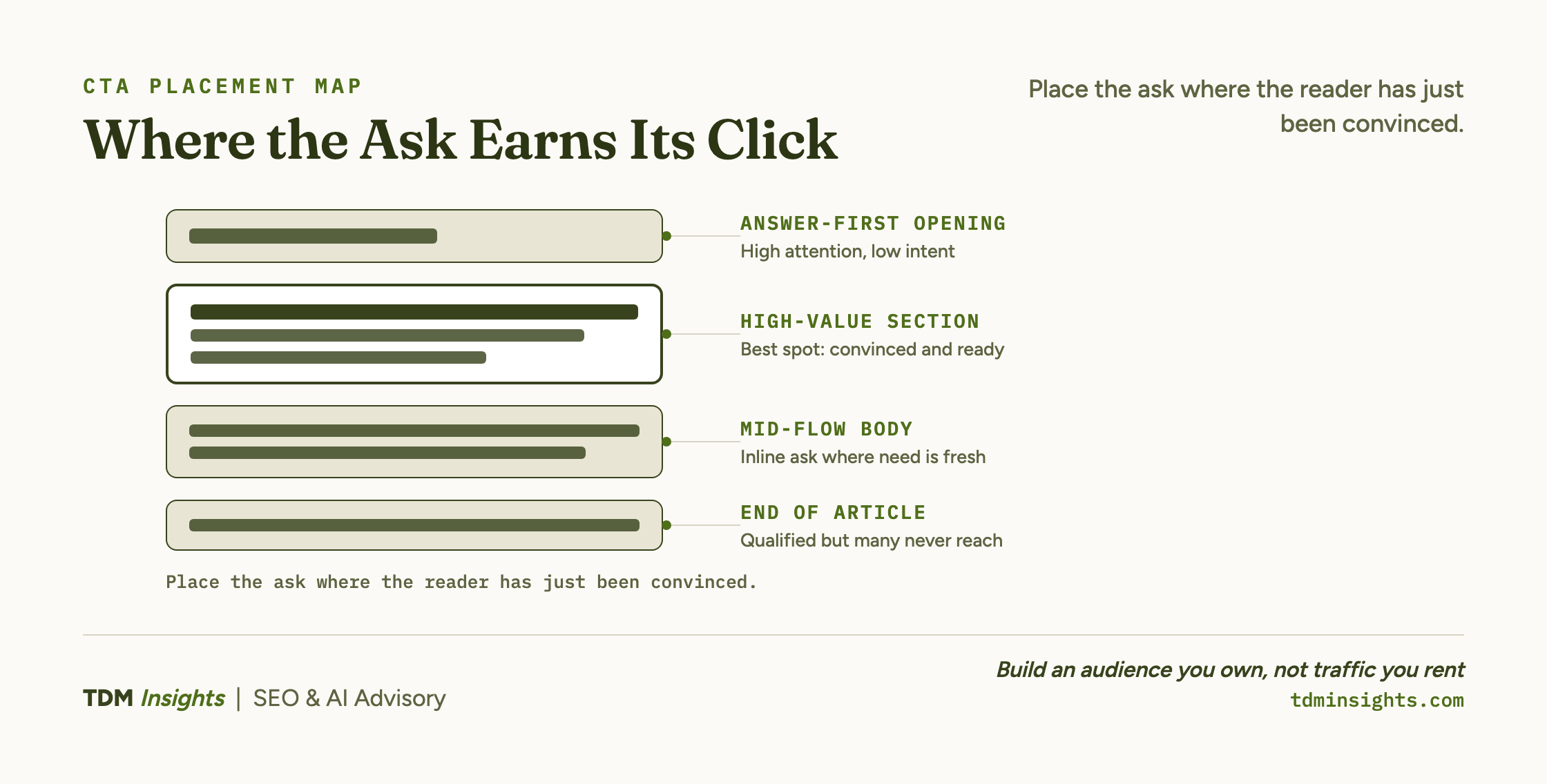
Here is the map. Each zone has a different level of attention and a different reason a CTA does or does not belong there. Read it as a guide to where the one ask earns its click, not a list of slots to fill (the one-CTA rule still holds: you are choosing where to place a single ask, sometimes repeated, never where to add a second one).
After the answer-first opening. Attention is high here, but intent usually is not. The reader has just landed and is deciding whether to stay, not whether to act. A hard ask this early reads as pushy and converts almost no one. The exception is a focused, high-intent landing page, where the reader arrived already knowing what they want and an early CTA simply saves them a scroll.
After the high-value section. This is the strongest spot on a content page. The reader has just received the thing the headline promised, the moment of “that was useful,” and attention and intent peak together. An in-line text ask here, framed as the natural next step, catches the reader at the exact point they are most persuaded and most willing to move.
End of article. Worth having, but weaker than it feels. A reader who finishes a long piece is highly qualified, so the end CTA converts that committed slice well. The catch is that scanning means many readers never reach the bottom, so an end-only CTA quietly misses the larger group who left earlier. Keep it, but do not rely on it alone.
Contextual inline. A relevant text ask placed mid-flow, right where the copy raises the need the CTA answers, often outperforms a designed banner many readers skim past. HubSpot’s study on anchor-text CTAs inside blog posts found the in-line text links drove the large majority of its blog leads while end-of-post banners contributed only a few percent, largely because of banner blindness, the well-documented habit of skipping anything that looks like an ad. Place the inline ask where the reader’s need is freshest, not on a fixed cadence.
The pattern across all four zones is the same. The ask works where the reader has just been given a reason to act and is paying attention. It fails where it interrupts before the value lands or where almost no one is still looking.
Book a free diagnosis
If a page gets traffic but few clicks on its CTA, the wording is rarely the real problem. The ask is usually sitting in a low-attention zone, firing before the value lands, or stranded below where readers stopped. A free diagnosis maps your highest-traffic pages against where attention actually pools, then points to the exact CTAs to reposition first. You leave with a prioritized placement fix list for the pages you already have.
One Page, Two Right Answers: The Worked Example
Take one ask, “book a free consultation,” and put it on two different pages. The right placement is not the same on both, which is the whole point.
On a focused landing page, the page exists to drive that single action. The reader clicked an ad or a link that already named the offer, so intent is high from the first pixel.
Here the CTA belongs above the fold, seen immediately, and repeated again lower down for the reader who scrolled to check the proof first. The page is short, navigation is stripped, and every section funnels toward the same button.
The choice of where to position that ask is one of the best-studied questions in conversion design. Instapage’s review of whether a CTA should sit above or below the fold lands on the same answer: it depends on how much convincing the reader needs first.
On a long blog post about the problem the consultation solves, the reader arrived to learn, not to buy. This is where landing page copy and blog copy part ways: the page type sets what the CTA is allowed to do.
Drop the same above-the-fold button here and it fires before you have earned anything, so it converts almost no one and signals you misjudged the reader. The stronger placement is an in-line text ask right after the section that delivers the article’s core insight, plus one at the end for the committed finisher.
Same ask, same words, two different homes, because the reader’s attention and intent peak at different points on each page.
That is the rule made concrete. Placement is not a property of the CTA. It is a property of where, on this specific page, the reader is convinced.
Should the CTA Sit Above the Fold or at the End?
The honest answer is that it depends on the page type, and the page type is set by how the reader arrived. It splits cleanly:
- A high-intent landing page benefits from a CTA above the fold, because the reader is already there to act and a visible ask removes friction.
- A content-heavy page usually converts better with the ask placed after the value is delivered, because the readers who scroll past the opening are the ones showing real intent, and they have just been given a reason to act.
The fold itself matters less than founders assume. CXL’s analysis of what the fold actually means for behavior shows readers will scroll when the copy gives them a reason, so a strong section below the fold is not wasted.
The reliable version of the rule ignores the fold entirely and asks a better question: place the CTA under the copy that earns it. On a landing page that copy is the headline and the offer, so the ask comes early. On an article that copy is the section that pays off the title, so the ask comes after it.
The fold is a screen-size accident. The decision point is a reader-state fact, and the reader is who you are placing for.
Repeat the One Ask, Never Add a Second
On a long page, one CTA is easy to miss. Different readers reach their decision point at different scroll depths, so a single ask placed once meets only the readers who happen to pause there.
This connects to a deeper conversion idea Unbounce calls the attention ratio, the count of things a page asks the reader to do against the one thing you want them to do. Repeating one ask keeps that ratio clean; adding a second one wrecks it.
Repeating the same ask fixes the coverage problem. It meets the reader at more than one decision point without changing what you are asking for, so the early-deciders and the finishers both get a clean prompt.
On a long landing page, the same “book a call” ask near the top, again after the proof, and once at the end is not clutter. It is coverage.
The visual treatment of that repeated button matters too. VWO’s guide to call-to-action buttons walks through the contrast, size, and labeling that decide whether a well-placed ask actually gets seen.
What hurts is introducing a different ask. The moment the second CTA says something else, subscribe here, download that, follow over there, you have split the reader’s attention and broken the discipline that makes the page convert.
Repeat one ask as often as the length warrants. Never add a competing one. Placement multiplies a single ask; it does not license a second.
How Do You Test Placement Without Breaking Conversion?
Change one thing at a time and keep the single ask intact. The reason placement tests often come back unreadable is that the founder moved the CTA and rewrote it in the same change, so the result cannot say which edit moved the number. Optimizely’s primer on how A/B testing isolates a single variable is the discipline to borrow here: one change per test, or the result tells you nothing.
Keep the test clean with a few rules:
- Test position, not a new ask. Try the same CTA after a different section, or above versus below the fold.
- Compare per-page conversion, not the site-wide average, which buries the signal.
- Run each variant long enough to gather real data rather than a few days of noise.
Google’s own guidance on creating helpful, people-first content is a useful sanity check: a CTA that helps the reader take the obvious next step belongs on the page, while one that interrupts the value they came for works against it. Place for the reader’s task, then test inside that constraint.
A page that converts is not the one with the cleverest button. It is the one that puts a single, stage-matched ask where the reader has just been given a reason to act and is still paying attention.
The placement question is really a funnel question: each page has one stage-matched job, and the CTA goes where that job is done. Get the placement right and the same words you already have start earning the clicks they were not getting.
Frequently Asked Questions
Where on a page should the CTA go?
Place the CTA where attention and intent meet: right after the page delivers the value its headline promised, at a natural decision point. People do not read top to bottom; they scan and pause at predictable spots. Putting the ask at one of those pauses, when the reader is convinced, beats a fixed rule like “always at the top.”
Should the CTA be above the fold, at the end, or both?
It depends on the page. A simple, high-intent landing page benefits from a CTA above the fold where it is seen immediately. A content-heavy page often converts better with the ask after the value is delivered, because readers who scroll show stronger intent. The reliable answer is to place the ask under the copy that earns it.
How does CTA placement differ on a blog post versus a landing page?
On a landing page the CTA usually appears early and repeats, since the whole page exists to drive one action. On a blog post the strongest spot is often an in-line text ask partway through, plus one at the end, because readers skim and many never reach the bottom banner. Placement follows how each page type is read.
Does repeating the same CTA down the page help or hurt?
Repeating the same single ask helps, especially on long pages, because it meets the reader at more than one decision point. What hurts is introducing a different ask, which breaks the one-CTA rule and splits attention. Repeat one CTA as often as the page length warrants; never add a second, competing one.
How do I match placement to how people actually read?
Map the page’s high-attention zones. Research shows people scan in an F-pattern: across the top, then down the left, with a few horizontal sweeps. Headings and the first lines of paragraphs get the most fixations. Put your ask near those high-attention zones and after the value lands, not buried in a low-attention block of body text.
How do I test CTA placement without breaking conversion?
Change one thing at a time and keep the one-CTA rule intact. Test position, not a second ask: try the same CTA after a different section, or above versus below the fold, and compare per-page conversion. Run each variant long enough to gather real data, and avoid testing copy and placement at once, which muddies the result.
Continue Reading:
More On Content Conversion:
- How to Build a Content Funnel (TOFU to BOFU)
- The One-CTA Rule: One Ask Per Page Wins
- Landing Page Copy vs Blog Copy: The Difference
- Content-Market Fit: Earn Customers, Not Traffic
- Content ROI: How to Calculate It vs Ad Spend
More from TDM Insights:
- Content That Converts Readers Into Customers
- How to Write FAQs That Double as AEO Fuel
- Search Intent: The Four Types That Decide Everything
- Internal Linking: The Most Underrated SEO Lever
- Content Strategy for Founders
Explore TDM Insights Categories: